Wednesday, June 10, 2015

Genius hour

Geniuos hour


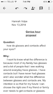
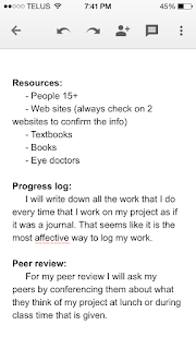
         Brain storming.                                            Proposal with conference notes


         Presentation


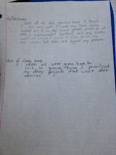
Reflections

Genius hour reflection

Looking back at my genius hour project process I am most proud of my outline. I am most proud of my outline because from my speech meet outline I didn't fully understand and I didn't do it right so I had to redo it. On my genius hour speech I understood how to do the outline and did it right the first time.

2.   One of my biggest challenges in the genius hour project was choosing my topic. I think this because I had a really hard time with coming up with a topic that is interesting for people to listen to and I could learn something from. I learned that if I put to much. Time into choosing a topic I just take away time that I can research. If I could have done something differently about choosing my topic I would have chosen a topic not as alike to my speech meet one. Also I would have made a visual too because when I didn't, I lost marks.

3. I think my biggest learning was that there are ways to avoid animal testing. There is a synthetic skin which has the same reactions as human or animals would have. But even thought there are ways to avoid it, people still test on animals. That was a big surprise to me because I thought that since there is so much against IT companies would jump to be able to not test on animals.

Tuesday, June 9, 2015

Genius Hour

1. Brain storm


2. Process 


3. Peer review 

4. Reflections and self evaluation


5. feedback

6. Proposal
 

7. Project


Monday, June 8, 2015

Religion and Renaissance reflections

Religion poster - 2 stars and 1 wish

2 stars

  •  For my first star, I thought our (Julia and I) poster was well organized and very clear by having the holiday's name and the religion's name with bigger font. Also we had everything in line such as Religion name with the symbol of the Religion and the picture of the holiday with the holiday name for easier understanding
  • I also thought the picture I chose was well selected because without explaining,  just looking at the pictures of the holiday, one can understand what they do on a holiday. On Hanukkah, for example, they light candles called menorah and the picture under the word Hanukkah has people standing in front of candles. 

1 wish

  • I wish there must be a little more information on our poster although the pictures themselves can be understood, I don't feel that there is enough information on the poster. Unless people can hear Julia and me explaining, they will not get the whole information about the Religions.


Renaissance poster - Self assess


I think I deserve an A because I felt like I met all the criteria because everything in the poster have connections such as all the lines were colour coded and there were different sizes of lines to show sub-topic, main ideas, and small ideas. It is also well spaced out, clean, and have  clear meanings. I have 5 different sub-topics which has 5 different colours for a easier understanding of what belongs to which sub-topic. It is also very neat so anyone could read what is written. I also drew pictures, venn diagrams, and a legend. I think I have done all the expectation for an A, so I think I deserve an A.


What did you learn from these two assignments? What are you most proud of?

I learnt how to shorten sentences but could still explain everything by a graphic organizer. Also that organization skills were as important as the information on the poster. If the informations on the poster are really good but none of them are organized it would be useless because no one would be able to understand anything.
I am most proud of getting it done in short amount of time given in class because I tent to concentrate better in class rather than working at home because I have a lot of distraction at home. Also I'm not very organized person so I thought my project wouldn't be as neat but it turned out very neat than what I have thought. I have never thought that I would deserve an A for this project but I realized I have followed all the criteria for an A so I'm also proud of that as well.

Descriptive poetry

They come in all sizes and shapes
Many colours like rainbows
Float higher than the clouds
Have all the freedom in the world 
Although some are tied down
give all kids and adults happiness
And at the end of their life they go with a loud pop

Sunday, June 7, 2015

Religion+Renaissance Reflections

2 stars and 1 wish for my religion poster

2 stars: I think that I did well organizing the pictures with the words, as well as using the space well.

1 wish: I wish that I did better getting more work done during class time. I had to go to flex to finish it and though I used the class time provided, I still failed to complete it within the time given.

What letter grade would I assign myself?

I would assign myself an A.
Although I did have problems starting my project, I feel like the space used up was pretty well, and I felt that my poster looked very balanced and organized. My poster started off with a huge venn diagram with little diagrams and graphs to explain my information. The colours that I used (red, blue, purple) represented early days, nowadays, and both (red+blue=purple). I also had pictures, and described the meaning of the ones that didn't make clear sense. I feel like I have completed the requirements for an A, which is why overall, I think that I deserve an A.

What did you learn from these two assignments? What are you most proud of?

I learned from these assignments that time managing is very important. For the religion poster, we had no time outside of class to work on it, and that was the most challenging thing for me. I'm really used to finishing my stuff at home, because I don't like doing my work in front of other people. However, I (with difficulties) managed to get it done, and was pretty proud of what I had accomplished within that small time frame. As for my renaissance project, it again, had me stressed because I had no idea how to start it. I had all my layouts ready and all, but I couldn't lay a hand on it when I started to fill in my notes. I kept pushing that part back, and when I finally decided to work on it, I was completely baffled because I had completely blacked out on it. However, knowing that the due date was near, I finished it, and although I could've added more notes, I was proud of it. I never thought that it would look organized, and I thought that it would turn out to be a complete disaster. Overall, I was most proud of what my finished product looked like; even after all of the time wasted, with some last minute changes. 


(Couldn't upload pictures so I might need help with that on Monday, Ms.Lees)

Poem

The Sun

So high in the sky it hugs the earth. Not a day goes by when the sun doesn't shine,always poking through the clouds like a rainbow on a rainy day.
So high in the sky it glows like a glow stick on a dark stormy night.
So high in the sky the light beams are as radiant as high beams.
So high in the sky it hugs the earth.

Poster reflections

Religion Poster:
- 2 Stars:
  1. One thing I thought I did well was use the right amount of pictures and drawings to represent my ideas and information. Yes, there were a few words but overall I found that my poster/visual aid was neatly portrayed and the information was not jumbled and scattered, you could easily tell where each piece of information was suppose to be and in which category it belonged to.
  2. The second star I would give myself would be based on my organization skills with all the notes and being able to divide the work among 2 people equally. My notes were a bit vague but I felt that they were organized and there was the right amount of information on it.
- 1 Wish:
  1. I wish of mine after this project would be to probably re-do or re-present my project. Why? because of the fact I had to present while someone else was having a meeting, which caused me to speak quietly and rapidly because I felt that I would disturb them, this also made me extremely nervous having older students possibly hear and watch me as I presented a project. The set-up of the whole presentation was just irregular and receiving that C+ was definitely something heart-breaking, therefore my wish is to be able to not have gone through that and presented in front of the class instead of doing it during a meeting and flex.

The purpose: The purpose of the visual aid for this religion project is to be using only pictures and orally sending out the information and using the visual aid to describe and support what you are mainly speaking about.

Renaissance Poster:
I feel that I deserve an A/B because I felt that I had fulfilled most/nearly all of the criteria for this project; everything was colour coded and the details and information were clear and organized. Not only did I have neatly organized work but I also used other methods of expressing information such as comparison using venn-diagrams and charts. I also added a few things like comparing methods used from during the Renaissance time to the present time. My information was also divided neatly into 4 categories and was coded specifically so that you would know where each piece of information belonged. In my opinion I think that I have a lot of information, I added in a few things that we hadn’t specifically learnt about to make my poster to be more interesting and intriguing. In conclusion, I think more of an A for this project because I used my time wisely and went full out as well as spent hours on end working on this project over the weekend.

What did I learn?
  • I learnt that with so much information, we can shrink it down into just a few smaller pictures and words, yet describe and receive the same amount of material, however in one we must take a lot of time and effort to write everything out as well as speak, whereas the other way is much easier where you only have to choose a few pictures and just oral explain everything.

What am I most proud of?
  • I’m honestly most proud of my Renaissance poster because with so much information and so little time, I was able to meet nearly all the criteria and expectations, I was also able to fit so much information onto a small poster. I’m also proud of the amount of time and effort I was able to put into this. In all honesty, I doubted myself very much in this project, I thought I wasn’t going to finish or even if I did finish it wouldn’t be neat and nice, however it ended up nicer, a lot nicer than I thought it would.